
🤖 Quick Answer:
Property management analytics for financial performance encompasses comprehensive tracking of Net Operating Income (NOI), revenue per unit, operating expense ratios, budget variance, utility rebill efficiency, and economic vs. physical occupancy—enabling multifamily asset managers to identify optimization opportunities worth 1-5% NOI improvement annually. Purpose-built BI platforms like BubbleGum BI deliver daily-updated financial dashboards with automated expense categorization, utility rebill tracking, and portfolio-level benchmarking, proven to generate measurable results including 19.1% turnover cost reduction and +1.1% NOI improvement through data-driven financial management.
Why Financial Analytics Matter in 2025 Multifamily Management
In the current multifamily landscape of elevated operating expenses, compressed cap rates, and intense investor scrutiny, financial performance optimization has become the defining factor separating high-performing portfolios from those struggling to meet underwriting projections. While occupancy and leasing metrics capture operational health, financial analytics reveal the ultimate measure of success: profitability and cash flow generation.
The challenge facing most asset managers isn't a lack of financial data—modern property management systems generate comprehensive income statements, GL exports, and budget reports. The challenge is transforming that financial data into actionable insights that drive better expense management, revenue optimization, and strategic capital allocation.

📊 Industry Reality:
According to the National Multifamily Housing Council, operating expenses have increased 4-6% annually over the past three years—significantly outpacing rent growth in many markets. Properties that implement comprehensive financial analytics to identify expense optimization opportunities and revenue leakage consistently outperform those relying solely on month-end income statements, with NOI improvements averaging 2-4% annually through data-driven financial management.
This is where purpose-built financial analytics deliver measurable value. Rather than manually compiling income statements, reconciling utility rebill, and creating budget variance reports in Excel, asset managers using platforms like BubbleGum BI access daily-updated financial dashboards with automated expense categorization, revenue tracking, and portfolio-level benchmarking—freeing strategic time while improving financial outcomes.
What Are Property Management Financial Analytics?
📖 Definition:
Property management financial analytics are specialized BI tools that transform property-level financial data from PMS systems into strategic insights for revenue optimization, expense management, and NOI growth. Effective financial analytics provide daily-updated visibility into Net Operating Income performance, revenue per unit trends, operating expense ratios, budget variance, utility rebill efficiency, economic vs. physical occupancy gaps, and portfolio-level financial benchmarking—enabling proactive management rather than reactive month-end reporting.
Comprehensive property management financial analytics encompass several key areas:
- NOI Tracking & Trending – Daily visibility into the fundamental profitability metric with historical comparisons
- Revenue Analytics – Gross vs. effective revenue, revenue per unit, ancillary income tracking, and revenue leakage identification
- Expense Management – Operating expense ratio (OER) benchmarking, category-level expense tracking, and variance analysis
- Budget Performance – Real-time variance to budget on both revenue and expense sides with drill-down capabilities
- Utility Rebill Optimization – Billing accuracy tracking, recovery rates, and revenue capture from RUBS/submeter programs
- Economic Occupancy Analysis – True revenue performance accounting for concessions, bad debt, and collection losses
- Portfolio Benchmarking – Cross-property financial performance comparison to identify best practices and optimization opportunities
The most effective approach combines all these elements into a unified financial analytics framework accessible through daily-updated dashboards rather than waiting for month-end close processes.
NOI Fundamentals: The Core Financial Metric
Net Operating Income (NOI) is the fundamental measure of property financial performance—representing the income remaining after operating expenses but before debt service and capital expenditures. It's the metric that drives property valuations, determines refinancing capacity, and measures management effectiveness.
NOI = Gross Rental Income + Other Income - Operating Expenses
Components Breakdown:
• Gross Rental Income: Base rent, renewal increases, market rent growth
• Other Income: Parking, pet fees, utilities (RUBS), amenity fees, late fees, damage charges
• Operating Expenses: Payroll, maintenance, utilities, insurance, property taxes, marketing, management fees
Why Daily NOI Tracking Matters
Traditional month-end NOI reporting creates a critical blind spot: problems are discovered 15-30 days after they begin. This delayed visibility means revenue shortfalls or expense overruns have already impacted the bottom line before anyone recognizes the issue.
Daily NOI tracking through purpose-built BI platforms enables:
- Early Problem Identification: Spot revenue declines or expense overruns within 24-48 hours rather than waiting for month-end
- Trend Recognition: Understand whether current month performance is improving, declining, or stable
- Proactive Intervention: Address issues before they compound into larger financial problems
- Budget Comparison: Track variance to budget continuously rather than monthly snapshots
- Portfolio Visibility: Instantly identify which properties are underperforming financially
💡 Key Insight:
Asset managers using daily NOI dashboards report catching budget variance issues an average of 18-24 days earlier than those relying on month-end close. This early identification enables corrective action that prevents 40-60% of potential variance from occurring—directly improving financial performance and budget accuracy.
NOI Margin Analysis
Beyond absolute NOI dollars, NOI margin (NOI as percentage of gross operating income) reveals operational efficiency and enables fair portfolio comparisons:
2025 US Benchmarks:
- Class A Properties: 60-70% NOI margin (newer, more efficient buildings)
- Class B Properties: 50-60% NOI margin (moderate age/amenities)
- Class C Properties: 45-55% NOI margin (older buildings, higher maintenance)
Properties with NOI margins significantly outside these ranges warrant investigation—either exceptional efficiency, deferred maintenance issues, or revenue optimization opportunities.
Revenue Optimization: Beyond Basic Rent Collection
While base rental income represents 80-85% of total property revenue, ancillary income and revenue leakage prevention significantly impact NOI. Comprehensive revenue analytics reveal opportunities often overlooked in basic PMS reporting.
Revenue Per Unit (RevPU) Analysis
Revenue Per Unit normalizes performance across properties of different sizes, enabling fair portfolio comparisons:
Why it matters: RevPU trending reveals whether revenue growth is keeping pace with market conditions, identifies properties with low ancillary income capture, and enables performance benchmarking across the portfolio.
BubbleGum BI tracking: Daily RevPU with breakdown of:
- Base Rent Revenue: Core rental income performance
- Ancillary Revenue: Parking, pet fees, storage, amenities
- Utility Revenue: RUBS or submetering recovery
- Other Revenue: Late fees, application fees, damage charges
Ancillary Income Optimization
Many properties leave significant revenue on the table through incomplete ancillary income capture. Common optimization opportunities:
🐾 Pet Fee Analysis
Are you billing pet fees for all pet-owning residents? Analytics comparing lease agreements to actual billing reveals gaps. Average opportunity: $40-70/month per pet.
🚗 Parking Revenue
Assigned parking, covered parking, and reserved spaces often go unbilled. Analytics tracking parking inventory vs. billing identifies $30-150/unit/month in missed revenue.
🔧 Utility Submeter/RUBS
Incomplete utility billing—missed apartments, billing errors, or recovery rate gaps—represents $20-80/unit/month in lost revenue. See utility rebill section below for details.
📦 Storage & Amenities
Storage units, premium amenity access, and other services frequently miss billing. Financial analytics comparing available inventory to billing reveals gaps averaging $15-40/unit/month.
Across a 200-unit portfolio, capturing just $50/unit/month in previously missed ancillary revenue represents $120,000 in annual NOI improvement—often achievable through better financial analytics visibility.
Expense Management & Operating Efficiency
With operating expenses rising 4-6% annually while rent growth moderates in many markets, expense optimization has become equally important as revenue growth for NOI improvement.
Operating Expense Ratio (OER) Benchmarking
The Operating Expense Ratio measures operational efficiency by comparing operating expenses to gross operating income:
2025 US Benchmarks:
- Class A Properties: 30-40% OER
- Class B Properties: 40-50% OER
- Class C Properties: 45-55% OER

Why portfolio-level OER comparison matters: Properties with OERs significantly outside expected ranges require investigation. High OER may indicate expense inefficiency, deferred maintenance catching up, or revenue underperformance. Unusually low OER might signal deferred maintenance or incomplete expense capture.
Expense Category Deep-Dive
Effective expense management requires visibility beyond total operating expenses—you need category-level trending and benchmarking:
1. Turnover & Make-Ready Costs
One of the largest controllable expenses, averaging $3,000-$5,000 per turnover. Financial analytics tracking per-unit turnover costs reveal optimization opportunities.
📈 Real Result:
A BubbleGum BI user achieved 19.1% reduction in turnover costs through Turnover & Damages dashboard analytics revealing inconsistent damage charge billing and preventable turnover issues. The optimization delivered a +1.1% NOI improvement across the portfolio. Read the full turnover cost reduction case study →
2. Payroll Optimization
Typically 20-30% of operating expenses. Portfolio benchmarking reveals whether properties are overstaffed, understaffed, or optimally staffed relative to unit count and operational complexity.
3. Maintenance & Repairs
Tracking maintenance spend per unit and comparing across portfolio identifies properties with unusually high or low maintenance costs—indicating either efficiency opportunities or deferred maintenance risks.
4. Insurance & Property Taxes
While less controllable, tracking these as percentage of revenue and comparing to market benchmarks ensures you're not overpaying and helps budget accuracy.
Controllable vs. Non-Controllable Expenses
Effective financial analytics distinguish between:
- Controllable Expenses: Payroll, maintenance, turnover, marketing, management fees—areas where operational decisions directly impact costs
- Non-Controllable Expenses: Property taxes, insurance, some utilities—fixed or externally-determined costs
Focus expense optimization efforts on controllable categories where analytics-driven improvements deliver measurable NOI gains.
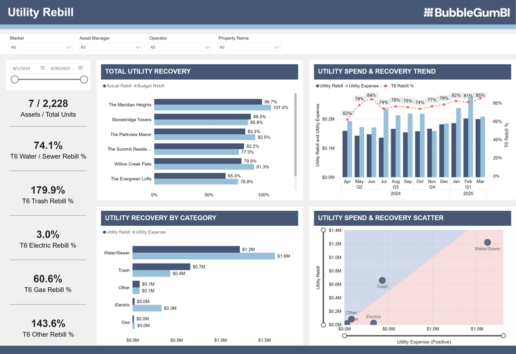
Utility Rebill Optimization: Recovering Hidden Revenue
Utility rebill programs (RUBS or submetering) represent a significant revenue stream for many properties—yet also one of the most common sources of revenue leakage due to billing errors, incomplete unit coverage, and recovery rate gaps.
The Utility Rebill Challenge
Properties using RUBS (Ratio Utility Billing System) or submetering frequently experience:
- Incomplete Unit Coverage: Some units missing from billing due to occupancy changes or data errors
- Billing Formula Errors: RUBS formulas not correctly configured in PMS, leading to under-recovery
- Recovery Rate Gaps: Total billed to residents doesn't match master utility expenses
- Timing Mismatches: Delays between utility invoice receipt and resident billing
- Manual Reconciliation Burden: Hours spent monthly reconciling utility bills to resident charges
The financial impact? Properties experiencing utility rebill inefficiency commonly leave $30,000-$100,000+ annually on the table across a portfolio—money that should flow directly to NOI.
BubbleGum BI's Utility Rebill Dashboard
Purpose-built utility rebill analytics provide:
- Recovery Rate Tracking: Percentage of master utility expenses recovered through resident billing
- Unit-Level Billing Verification: Identify units missing from utility billing
- Revenue Trending: Monthly utility rebill revenue performance and variance
- Formula Validation: Compare expected vs. actual billing to identify configuration issues
- Automated Reconciliation: Match master utility expenses to resident charges without manual Excel work
💰 Revenue Recovery Opportunity:
Asset managers implementing utility rebill analytics typically discover 3-8% of utility expenses are not being properly recovered—representing $200-$600 per unit annually in missed revenue. For a 200-unit portfolio, that's $40,000-$120,000 in annual NOI improvement through better billing accuracy and recovery rate optimization.
Key Utility Rebill Metrics
Essential utility rebill KPIs to track:
- Recovery Rate: (Resident Billing / Master Utility Expense) × 100 — Target: 85-95%
- Billing Coverage: (Units Billed / Occupied Units) × 100 — Target: 100%
- Revenue Per Unit: Average utility billing per occupied unit — Trend over time
- Variance to Master Bill: Dollar gap between master expense and resident recovery
Economic vs. Physical Occupancy: The Revenue Reality Gap
One of the most important—yet often overlooked—financial metrics is the gap between physical occupancy (percentage of units occupied) and economic occupancy (percentage of potential revenue actually collected).
📖 Definition:
Physical Occupancy measures units occupied vs. total units. Economic Occupancy measures actual collected revenue vs. gross potential rent—accounting for concessions, bad debt, vacancies, and collection losses. The gap between these two metrics reveals the true cost of concessions, collection issues, and pricing strategies.
Why the Gap Matters
A property can report 95% physical occupancy while experiencing only 88% economic occupancy—a 7-percentage-point gap that represents significant revenue loss:

Example: 200-Unit Property
- Gross Potential Rent: $300,000/month ($1,500 avg rent × 200 units)
- Physical Occupancy: 95% (190 units occupied)
- Physical Occupancy Revenue: $285,000 (95% × $300k)
- Concessions Cost: -$12,000/month (2 months free on 8 new leases)
- Bad Debt/Collections: -$3,000/month
- Actual Revenue Collected: $270,000/month
- Economic Occupancy: 90% ($270k / $300k)
- Gap: 5 percentage points = $15,000/month = $180,000 annually
Analyzing the Economic Occupancy Gap
Understanding why economic occupancy lags physical occupancy enables targeted optimization:
- Concession Cost Analysis: Track total concession dollars and duration—aggressive concessions may fill units but damage NOI
- Bad Debt Trending: Monitor collection losses as percentage of gross potential rent—high bad debt signals screening or collection issues
- Pricing Strategy Assessment: Large economic occupancy gaps may indicate over-reliance on concessions vs. optimizing base rent
- Market Positioning: Compare your economic occupancy gap to competitive set to assess relative pricing effectiveness
💡 Strategic Insight:
Properties with economic occupancy gaps exceeding 4-5 percentage points often benefit more from reducing concessions and improving pricing strategy than from pushing physical occupancy higher. A property at 92% physical occupancy with 90% economic occupancy (2-point gap) frequently generates more NOI than one at 95% physical occupancy with 88% economic occupancy (7-point gap).
Budget Variance Analysis for Proactive Management
Budget variance analysis—comparing actual financial performance to budgeted projections—is critical for proactive management, investor reporting, and strategic decision-making.
The Problem with Month-End Variance Reporting
Traditional month-end budget variance analysis suffers from a fundamental flaw: by the time you discover significant variance, the month is over and the opportunity to correct course has passed. This reactive approach leads to:
- Cascading budget misses throughout the year
- Investor surprises and credibility damage
- Missed opportunities for mid-course correction
- Annual budget variance that could have been prevented
Daily Budget Variance Dashboards
Purpose-built financial analytics provide daily budget variance visibility—showing month-to-date performance vs. budget with projections for end-of-month outcomes:
📈 Revenue Variance
Track actual revenue vs. budgeted revenue in real-time:
- Rental income performance
- Ancillary revenue capture
- Concession cost tracking
- Bad debt variance
📉 Expense Variance
Monitor operating expenses vs. budget by category:
- Payroll variance
- Maintenance spending
- Utility expenses
- Turnover cost trending
The proactive advantage: Identifying $15,000 unfavorable expense variance on day 15 of the month provides two weeks to implement corrective action—reducing the actual end-of-month variance by 40-60% through spending adjustments.
Key Budget Variance Metrics
Essential budget variance KPIs:
- NOI Variance ($): Actual NOI minus budgeted NOI
- NOI Variance (%): (Variance $ / Budget $) × 100
- Revenue Variance: Broken down by rental, ancillary, and other income
- Expense Variance: Broken down by major expense categories
- Projected End-of-Month Variance: Based on current pace
- Year-to-Date Variance: Cumulative performance vs. annual budget
Case Study: 19.1% Turnover Cost Reduction & +1.1% NOI Improvement
The power of comprehensive financial analytics is best demonstrated through measurable results. This case study illustrates how data-driven expense management delivers significant NOI improvement:
The Challenge
A multifamily portfolio was experiencing higher-than-expected turnover costs impacting NOI performance:
- Turnover costs exceeding $4,500 per unit—above market benchmarks
- Inconsistent damage charge billing across properties
- Limited visibility into what was driving high turnover expenses
- No systematic tracking of per-unit turnover costs or trends
- Manual Excel tracking providing incomplete and delayed insights
The asset management team recognized they needed detailed financial analytics to identify and address the root causes of elevated turnover expenses.
The BubbleGum BI Solution
Implementation of BubbleGum BI's Turnover & Damages dashboard provided comprehensive visibility:
- Per-Unit Turnover Cost Tracking: Detailed breakdown of make-ready costs, vacancy loss, and administrative expenses per move-out
- Damage Charge Analysis: Billing accuracy tracking revealing inconsistent damage charge capture
- Portfolio Benchmarking: Cross-property comparison identifying properties with unusually high turnover costs
- Trend Identification: Recognition that some properties were experiencing preventable turnovers due to maintenance issues
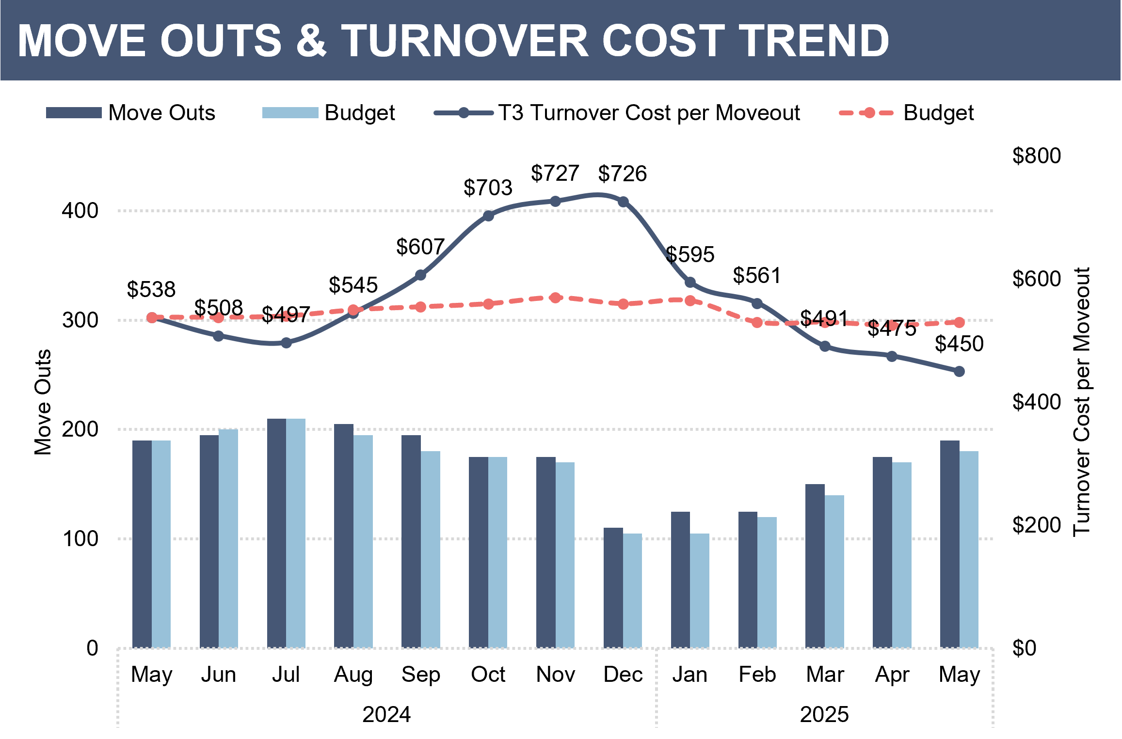
The Results
The portfolio achieved significant, measurable financial improvement:
📊 Primary Outcome
19.1% Reduction
Turnover costs decreased from $4,500+ per unit to $3,640 through data-driven optimization of damage billing and preventable turnover reduction
💰 NOI Impact
+1.1% NOI
Portfolio-wide NOI improvement of 1.1% through turnover cost optimization—representing tens of thousands in additional annual cash flow
Key Success Factors
Several specific insights drove the financial performance improvement:
- Damage Charge Billing Optimization: Analytics revealed significant inconsistency in damage charge billing—some properties billing only 40-50% of actual damages. Standardizing and improving billing capture recovered $800-$1,200 per turnover.
- Preventable Turnover Identification: Tracking revealed that maintenance-related move-outs (accounting for 15% of turnovers) were preventable through proactive unit improvements.
- Make-Ready Process Efficiency: Per-unit cost benchmarking identified properties with inefficient make-ready processes, enabling best-practice sharing and cost reduction.
- Vendor Cost Comparison: Portfolio-level analytics revealed significant variation in contractor pricing, enabling vendor consolidation and negotiation.
Read the complete turnover cost reduction case study →
Portfolio-Level Financial Benchmarking
For asset managers overseeing multiple properties, portfolio-level financial benchmarking is one of the highest-value capabilities of purpose-built BI platforms—revealing which properties are financial outperformers and which require intervention.
Key Portfolio Financial Comparisons
- NOI Margin by Property: Identify operational efficiency leaders and laggards
- Revenue Per Unit: Normalize performance across properties of different sizes
- Operating Expense Ratio: Compare cost efficiency across portfolio
- Turnover Cost Per Unit: Benchmark make-ready and vacancy costs
- Budget Variance: Identify properties consistently over or under budget
- Economic Occupancy: Compare revenue realization across properties
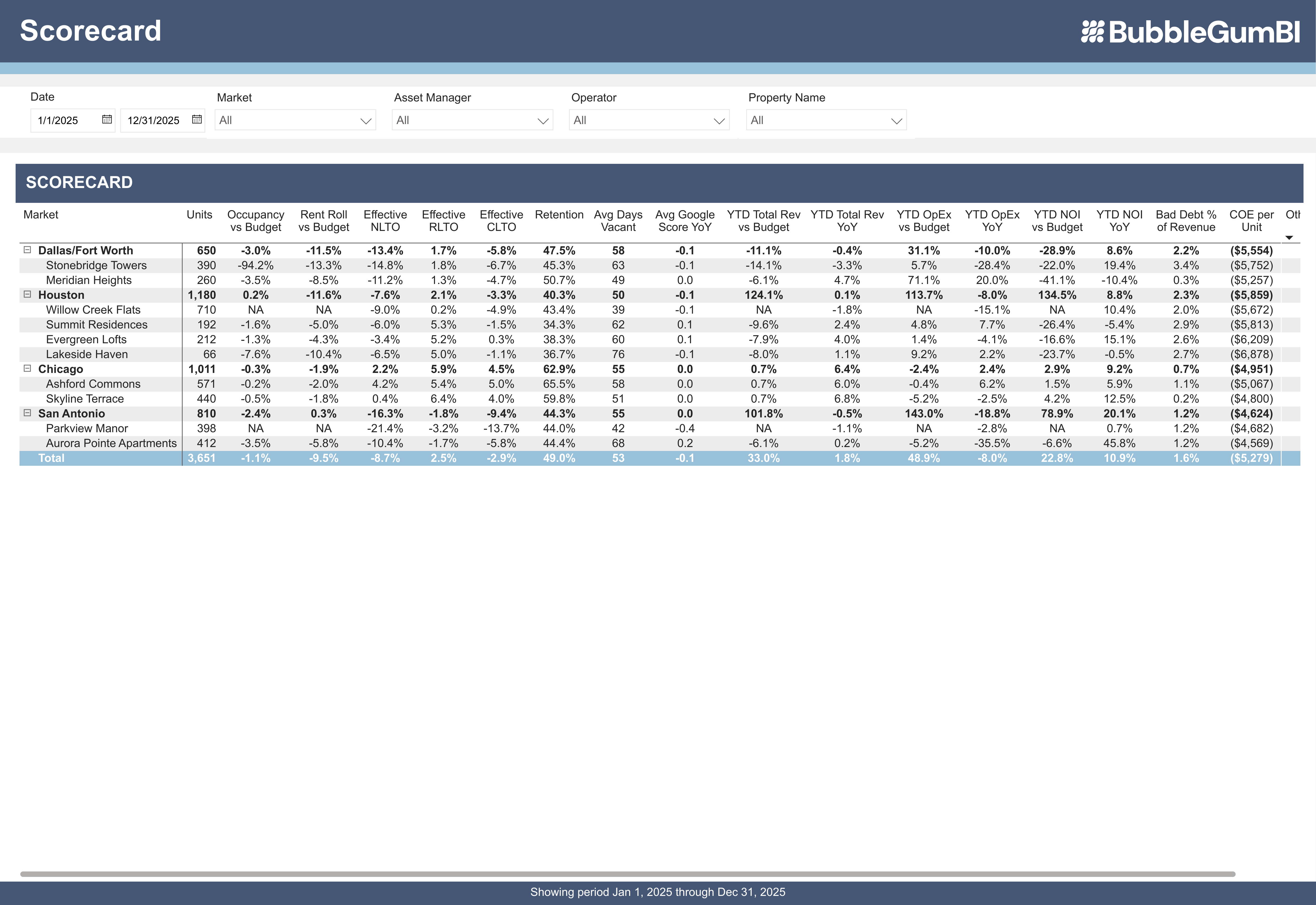
🎯 Portfolio Optimization Value:
Asset managers using portfolio-level financial benchmarking report identifying 1-3 properties requiring immediate intervention within the first month. Addressing underperformance at these properties through best-practice implementation from top performers typically delivers 2-5% NOI improvement at the targeted properties—often worth $50,000-$200,000+ annually per property depending on size.
Best Practice Identification
Portfolio benchmarking not only identifies underperformers—it reveals which properties are doing things exceptionally well so those best practices can be shared across the portfolio:
- Property with lowest turnover costs: What make-ready processes are they using?
- Property with highest ancillary revenue: What billing practices drive that performance?
- Property with best budget accuracy: What forecasting methods are they employing?
- Property with lowest OER: What operational efficiencies can be replicated?
This organizational learning—enabled by comprehensive financial analytics—delivers compounding benefits as best practices spread throughout the portfolio.
Implementing Financial Analytics Dashboards
The barriers to adopting comprehensive financial analytics have traditionally been high—months of custom configuration, expensive consultants, and ongoing maintenance. Purpose-built platforms eliminate these obstacles:
The BubbleGum BI Approach
- Direct PMS Integration: Automated data extraction from Yardi, RealPage, or Entrata—no manual exports or data entry
- Pre-Configured Financial Dashboards: NOI tracking, revenue analytics, expense management, utility rebill, and budget variance dashboards ready immediately
- 24-Hour Implementation: Full financial analytics accessible within one business day of providing PMS credentials
- Daily Automated Updates: Fresh financial data every morning without manual intervention
- Portfolio Consolidation: Unified financial analytics across all properties regardless of PMS platform

⚡ Implementation Speed Advantage:
The 24-hour implementation capability means asset managers see financial insights and identify optimization opportunities within the first week—contrasting dramatically with 3-6 month generic BI implementations. This rapid time-to-value enables quick ROI through early identification of revenue leakage, expense optimization opportunities, and budget variance issues.
No Operational Disruption
BubbleGum BI operates as a BI analytics layer on top of your PMS—it doesn't replace or disrupt existing systems:
- Read-Only Data Access: One-way sync from PMS (no data written back)
- No Process Changes: Site teams continue existing workflows in PMS
- Leadership-Only Tool: Asset managers and directors access dashboards; no site-level training required
- Complements PMS Investment: Maximizes value of existing system rather than replacing it
Frequently Asked Questions: Property Management Financial Analytics
What are the most important financial metrics for multifamily asset managers?
The most important financial metrics include: Net Operating Income (NOI) and NOI margin, revenue per unit (RevPU), operating expense ratio (OER), budget variance (revenue and expense), turnover cost per unit, utility rebill recovery rate, economic vs. physical occupancy gap, and ancillary income capture. Daily tracking of these metrics through purpose-built BI platforms like BubbleGum BI enables proactive financial management, with proven results including 19.1% turnover cost reduction and +1.1% NOI improvement through data-driven optimization.
How do I calculate NOI for my multifamily properties?
NOI (Net Operating Income) = Total Rental Income + Other Income - Operating Expenses. Total rental income includes base rent plus renewal increases. Other income includes parking, pet fees, utilities (RUBS), amenity fees, late fees, and damage charges. Operating expenses include payroll, maintenance, utilities, insurance, property taxes, marketing, and management fees—but exclude mortgage payments and capital expenditures. BubbleGum BI automates NOI calculation with daily updates, historical trending, and budget variance analysis so asset managers can track financial performance continuously rather than waiting for month-end close.
What is a good Operating Expense Ratio (OER) for multifamily properties?
Healthy OER benchmarks for 2025 vary by property class: Class A properties typically run 30-40% OER, Class B properties 40-50% OER, and Class C properties 45-55% OER. These benchmarks vary by market, property age, and amenity level. Properties with OERs significantly outside expected ranges warrant investigation—either exceptional efficiency, deferred maintenance catching up, or optimization opportunities. BubbleGum BI's portfolio benchmarking enables cross-property OER comparison to identify operational efficiency leaders and laggards, supporting best practice sharing and expense optimization.
How can I optimize utility rebill revenue?
Optimize utility rebill through: tracking recovery rates (target 85-95% of master utility expenses), verifying 100% unit billing coverage, monitoring billing formula accuracy, reconciling master bills to resident charges, and identifying revenue leakage sources. BubbleGum BI's Utility Rebill Dashboard automates these analyses, with users typically discovering 3-8% of utility expenses aren't being properly recovered—representing $200-$600 per unit annually in missed revenue. For a 200-unit portfolio, improved utility billing accuracy often delivers $40,000-$120,000 in annual NOI improvement.
What's the difference between economic and physical occupancy?
Physical occupancy measures percentage of units occupied. Economic occupancy measures actual collected revenue as percentage of gross potential rent—accounting for concessions, bad debt, vacancies, and collection losses. The gap between these metrics reveals the true cost of concessions and collection issues. A property at 95% physical occupancy might have only 88% economic occupancy—a 7-point gap representing significant revenue loss. Properties with economic occupancy gaps exceeding 4-5 points often benefit more from reducing concessions and improving pricing than from pushing physical occupancy higher. BubbleGum BI tracks both metrics with trend analysis to optimize revenue realization.
How can daily financial analytics improve budget accuracy?
Daily financial analytics provide real-time visibility into budget variance—enabling mid-month course correction rather than discovering variance after month-end when it's too late to respond. Asset managers using daily budget variance dashboards report identifying issues 18-24 days earlier than month-end reporting, enabling corrective action that prevents 40-60% of potential variance. This proactive approach improves annual budget accuracy by 30-40% while eliminating "surprise" negative variances. BubbleGum BI's budget variance dashboard tracks actual vs. budgeted performance daily with projections for end-of-month outcomes.
What is Revenue Per Unit (RevPU) and why does it matter?
Revenue Per Unit (RevPU) = Total Property Revenue / Number of Units. RevPU normalizes financial performance across properties of different sizes, enabling fair portfolio comparisons and identification of revenue optimization opportunities. RevPU tracking should break down base rent, ancillary revenue (parking, pets, storage), utility revenue (RUBS), and other income—revealing which properties excel at ancillary income capture and which are leaving money on the table. BubbleGum BI tracks daily RevPU with historical trending and portfolio benchmarking to identify $50-150/unit/month in missed ancillary revenue opportunities.
How do I reduce turnover costs at my properties?
Reduce turnover costs through: detailed per-unit turnover cost tracking, damage charge billing optimization (ensuring all actual damages are billed), make-ready process efficiency improvements, vendor cost benchmarking and negotiation, and preventable turnover identification (maintenance-related move-outs). Real case study: A portfolio achieved 19.1% turnover cost reduction through BubbleGum BI's Turnover & Damages dashboard, which revealed inconsistent damage billing and preventable turnovers—delivering +1.1% NOI improvement. Effective turnover cost management requires unit-level analytics rather than property-wide averages.
What's the ROI of implementing financial analytics for multifamily?
Multifamily asset managers typically see 10-20x ROI through: NOI improvement of 1-5% annually via expense optimization and revenue leakage prevention, utility rebill optimization recovering $40,000-$120,000 per 200-unit portfolio, turnover cost reduction of 15-20% (case study: 19.1% reduction), improved budget accuracy reducing variance surprises, and 60-80% time savings on financial reporting. Real results include +1.1% NOI improvement through turnover optimization and tens of thousands in recovered utility rebill revenue. Combined financial optimization opportunities typically deliver payback in 2-4 months with ongoing annual NOI benefits of 2-4%.
How does portfolio-level financial benchmarking work?
Portfolio-level financial benchmarking compares key financial metrics across all properties: NOI margin, revenue per unit, operating expense ratio, turnover costs, budget variance, and economic occupancy. This cross-property comparison identifies both underperformers requiring intervention and top performers whose best practices can be shared portfolio-wide. BubbleGum BI consolidates financial data from multiple PMS platforms into unified analytics, enabling fair comparisons and organizational learning. Asset managers using portfolio benchmarking report identifying 1-3 underperforming properties within the first month, with targeted improvements typically delivering 2-5% NOI gains at those properties.
Key Takeaways: Property Management Financial Analytics
- NOI as Core Metric: Daily NOI tracking with budget variance analysis enables early problem identification 18-24 days faster than month-end reporting, preventing 40-60% of potential variance
- Revenue Optimization: Comprehensive revenue analytics including RevPU, ancillary income tracking, and economic vs. physical occupancy gaps reveal $50-150/unit/month in optimization opportunities
- Expense Management: Operating expense ratio benchmarking, category-level tracking, and portfolio comparison identify controllable expense reduction opportunities worth 1-3% NOI improvement
- Utility Rebill Recovery: Purpose-built utility analytics typically discover 3-8% of expenses not properly recovered, representing $40,000-$120,000 annually per 200-unit portfolio
- Proven Results: Case study demonstrates 19.1% turnover cost reduction and +1.1% NOI improvement through data-driven financial analytics and damage charge optimization
- Economic Occupancy Gap: Tracking the gap between physical and economic occupancy reveals true cost of concessions and collection issues—properties with gaps exceeding 4-5 points benefit from pricing optimization
- Daily Budget Variance: Real-time variance visibility enables mid-month course correction, improving annual budget accuracy by 30-40% and eliminating surprise negative variances
- Portfolio Benchmarking: Cross-property financial comparison identifies underperformers requiring intervention and top performers whose best practices can be replicated—delivering 2-5% NOI improvement at targeted properties
Property management financial analytics have evolved from "nice-to-have" reporting tools to essential capabilities for maximizing multifamily portfolio performance in 2025's challenging operating environment. With expenses rising 4-6% annually and margin compression affecting most markets, comprehensive financial analytics delivering 1-5% NOI improvement through optimization represent the difference between meeting or missing investment objectives.
Purpose-built platforms like BubbleGum BI eliminate the traditional barriers of custom BI implementation—delivering pre-configured financial dashboards, automated PMS integration, and daily updates within 24 hours of setup. This rapid time-to-value enables asset managers to identify and capture financial optimization opportunities immediately rather than spending months building analytics infrastructure.
See Your Financial Analytics in Action
Book a short walkthrough to see how BubbleGum BI tracks NOI, OpEx ratio, utility rebill recovery, and portfolio benchmarks for your multifamily properties.
Book a Portfolio WalkthroughRelated Resources
- → The Ultimate Guide to Multifamily Business Intelligence & Analytics in 2026
- → Performance Metrics & Leasing Analytics: The Complete Guide
- → PMS Reporting vs. Purpose-Built BI: What's the Real Difference?
- → Case Study: 19.1% Turnover Cost Reduction & +1.1% NOI Improvement
- → Case Study: 4.5% Occupancy Improvement in 9 Months